
DPMO คือ
คำว่า DPMO ที่ย่อมาจาก Defects per million opportunities หมายถึง จำนวนของเสียต่อการปัฎิบัติการหนึ่งล้านครั้ง ยกตัวอย่าง เช่น '' เราผลิตงานมา1ล้านชิ้นแล้วเกิดของเสีย 1 ชิ้น เราจะเรียกว่า 1 DPMO'' เพราะฉนั้นแล้วจำนวน DPMO จะเพิ่มขึ้น เมื่อเกิดของเสียเพิ่มขึ้นเทียบกับจำนวนการผลิต โดยในหลักการของ Six sigma แล้ว เราต้องหาค่าผลิตภาพของกระบวนการซึ่งมีหน่วยเป็น DPMO นั้นเอง
โดยเราสามารถคำนวณค่า DPMO ได้จาก สูตรด้านล่าง
 เมื่อเราคำนวณออกมาแล้วเราจะได้ค่าผลิตภาพของกระบวนการผลิตออกมาหรือเรียกว่าค่า DPMO จากนั้นเราจะต้องนำไปเปรียบเทียบกับตาราง Six sigma ว่าเราจะได้กี่ sigma และเราควรมีการปรับปรุ่งกระบวนการผลิตเพิ่มเติมตรงไหนเพื่อให้จำนวนของเสียลดลง ท่านที่สนใจเข้าไปที่ บทความ Six sigma เพื่อเรียนรู้เพิ่มเติม

คำว่า DPMO ที่ย่อมาจาก Defects per million opportunities หมายถึง จำนวนของเสียต่อการปัฎิบัติการหนึ่งล้านครั้ง ยกตัวอย่าง เช่น '' เราผลิตงานมา1ล้านชิ้นแล้วเกิดของเสีย 1 ชิ้น เราจะเรียกว่า 1 DPMO'' เพราะฉนั้นแล้วจำนวน DPMO จะเพิ่มขึ้น เมื่อเกิดของเสียเพิ่มขึ้นเทียบกับจำนวนการผลิต โดยในหลักการของ Six sigma แล้ว เราต้องหาค่าผลิตภาพของกระบวนการซึ่งมีหน่วยเป็น DPMO นั้นเอง
โดยเราสามารถคำนวณค่า DPMO ได้จาก สูตรด้านล่าง

 |
| ตารางเทียบระดับของ ซิกมา |
ตัวอย่างการคำนวน DPMO เพื่อให้เข้าใจง่ายขึ้น โดยผมจะยกตัวอย่างกับงานที่ผมทำอยู่ตอนนี้นะครับโดยใช้ Excel ในการคำนวณแบบง่าย

ก่อนอื่นเรามาทำความเข้าใจกับรูปก่อนนะครับโดยผมจะอ้างถึงปี 2012
1. Total joint defect เป็นช่องที่ใส่จำนวนของเสียทั้งหมดที่ผลิตออกมา
2. Total joint เป็น ช่องที่ใส่ จำนวนงานที่ผลิตทั้งหมด ไม่ว่าจะเป็นงานดีหรืองานเสีย
3. Defect by DPMO ช่องนี้เป็นช่องผลการคำนวณค่า DPMO ที่ได้ครับ
วิธีการคำนวณ
1. .ให้เอาค่า 502,057,051 / 33,022*1000000 ก็จะได้ค่า 66 DPMO แล้วครับ และนำไปเปียบเทียบกับตาราง ระดับซิกมาต่อไป
วันนี้พอแค่นี้ก่อนนะครับและอย่าลืมแวะเข้าไปดูบทความอื่นๆในเว็บผมด้วยนะครับ ขอบคุณที่ให้การรับชม
Six sigma คือ

วันนี้จะกล่าวถึงบทความ six sigma ซึ่งจะเกี่ยวข้องกับการใช้ Minitab อยู่พอสมควรครับ เพราะระบบ six sigma เป็นหัวใจสำคัญของระบบสถิติที่ใช้กันแพร่หลายทั่วโลกครับ เพราะฉนั้นแล้วเราควรรู้จักครับว่า six sigma คืออะไร และมีคุณสมบัติอย่างไร
ซิกส์ซิกม่า(six sigma) คือ
ระดับคุณภาพของกระบวนการผลิตทีจะยอมให้มีของเสียในระบบการผลิตได้เพียง 3.4 ชิ้น ต่อการผลิตสินค้าทั้งหมด 1ล้านชิ้น และนอกจากนี้ยังเป็นเครื่องมือที่ช่วยให้ สามารถแก้ไขปัญหาคุณภาพของระบบกการผลิตได้อีกด้วย โดย ซิกส์ซิกมา(six sigma) นั้นมาจากการประยุกต์ความรู้ทางด้านสถิติมาใช้ โดยสมุมติให้ปรากฎการที่เกิดขึ้นในระบบเป็นการแจกแจงปกติ (normal distribution) หรือเรียกอีกอย่างหนึ่งว่าการกะจายเป็นรูประฆังคว่ำ โดยค่าเฉลี่ยที่จุดกึ่งกลางของการกระจายตัว นั้นก็คือค่าทีต้องการ ส่วนค่าซิกมา(sigma) คือ หนึ่งช่วงของความเบียงเบนมาตรฐานที่วัดจากจุดกึ่งกลางดังกล่าว

จากที่เห็นในรูปจะมีขอบเขตการยอมรับได้อยู่สองส่วนคือ ขอบเขตจำกัดบน(Upper specific limitation)หรือมีชื่อย่อเรียกว่า ''USL'' และมีขอบเขตจำกัดล่างคือ (Lower specific Limitation) หรือมีชื่อย่อเรียกว่า ''LSL'' ซึ่งในค่านิยามของ ซิกส์ซิกมา( six sigma) จะกล่าวไว้ว่า ถ้าขอบเขตบนและล่างอยู่ห่างจากค่าเฉลี่ยเป็น 3 ซิกมาก็จะเรียกว่าระดับ 3 ซิกมา (3 sigma level)แต่ถ้ามีระยะห่างเป็นระยะ 4 ซิกมา ก็จะเรียกว่าระดับ4ซิกมา (4 Sigma level) ตามลำดับ ซึ่งในแต่ละ ระดับจะแบ่งค่าได้ตามตารางด้านล่างนี้ โดยจะสัมพันธ์ กับ รูปกราฟ ด้านบน
โดย โมโตโรล่า ได้แนะนำไว้ว่า ค่าที่แกว่งตัวนี้จะอยู่ในช่วงของ 1.5 ซิกมา แต่ว่าค่าที่ได้มานี้ได้มาจาก ประสบการณ์ของโมโตโรล่าเอง ซึ่งก็ได้มีการพิสูจน์ในเชิงคณิตศาสตร์แล้ว โดยดาววิส โบท ในภายหลังว่า ค่า 1.5 นี้ สมเหตุสมผล ซึ่งค่าที่ได้จะเป็นค่าตามตารางด้านล่างนี้ และค่านี้คือค่าที่ยอมรับให้ใช้ในมาตรฐานของ 6 sigma.

การนำไปใช้
Six sigma เป็นหลักการที่ถูกประยกต์มาจากวิชาสถิติ ซึ่งแท้จริงแล้วได้มีการพัฒนามาแล้วกว่า 7 ทศวรรษ และเราสามมารถนำไปใช้ร่วมกับเครื่องมือต่างๆได้ เช่นที่นิยมมากทีสุดคือ DMAIC และ DMADV หรือในกการคำนวนหรือสร้างกราฟ อาจจะต้องใช้ Minitab เข้ามาช่วยก็จะทำให้ง่ายขึ้นใ
ที่มา: http://th.wikipedia.org/

วันนี้จะกล่าวถึงบทความ six sigma ซึ่งจะเกี่ยวข้องกับการใช้ Minitab อยู่พอสมควรครับ เพราะระบบ six sigma เป็นหัวใจสำคัญของระบบสถิติที่ใช้กันแพร่หลายทั่วโลกครับ เพราะฉนั้นแล้วเราควรรู้จักครับว่า six sigma คืออะไร และมีคุณสมบัติอย่างไร
ซิกส์ซิกม่า(six sigma) คือ
ระดับคุณภาพของกระบวนการผลิตทีจะยอมให้มีของเสียในระบบการผลิตได้เพียง 3.4 ชิ้น ต่อการผลิตสินค้าทั้งหมด 1ล้านชิ้น และนอกจากนี้ยังเป็นเครื่องมือที่ช่วยให้ สามารถแก้ไขปัญหาคุณภาพของระบบกการผลิตได้อีกด้วย โดย ซิกส์ซิกมา(six sigma) นั้นมาจากการประยุกต์ความรู้ทางด้านสถิติมาใช้ โดยสมุมติให้ปรากฎการที่เกิดขึ้นในระบบเป็นการแจกแจงปกติ (normal distribution) หรือเรียกอีกอย่างหนึ่งว่าการกะจายเป็นรูประฆังคว่ำ โดยค่าเฉลี่ยที่จุดกึ่งกลางของการกระจายตัว นั้นก็คือค่าทีต้องการ ส่วนค่าซิกมา(sigma) คือ หนึ่งช่วงของความเบียงเบนมาตรฐานที่วัดจากจุดกึ่งกลางดังกล่าว

จากที่เห็นในรูปจะมีขอบเขตการยอมรับได้อยู่สองส่วนคือ ขอบเขตจำกัดบน(Upper specific limitation)หรือมีชื่อย่อเรียกว่า ''USL'' และมีขอบเขตจำกัดล่างคือ (Lower specific Limitation) หรือมีชื่อย่อเรียกว่า ''LSL'' ซึ่งในค่านิยามของ ซิกส์ซิกมา( six sigma) จะกล่าวไว้ว่า ถ้าขอบเขตบนและล่างอยู่ห่างจากค่าเฉลี่ยเป็น 3 ซิกมาก็จะเรียกว่าระดับ 3 ซิกมา (3 sigma level)แต่ถ้ามีระยะห่างเป็นระยะ 4 ซิกมา ก็จะเรียกว่าระดับ4ซิกมา (4 Sigma level) ตามลำดับ ซึ่งในแต่ละ ระดับจะแบ่งค่าได้ตามตารางด้านล่างนี้ โดยจะสัมพันธ์ กับ รูปกราฟ ด้านบน
 |
| ตาราง นิยาม Sigma level |
ในตารางข้างต้น คำว่า DPMO หมายถึง จำนวนของเสียต่อการปัฎิบัติการล้านครั้ง (Defects per million Opportunities)
ตาราง ที่ยอมรับให้ใช้ในมาตรฐานระดับของ 6 ซิกมา
ตารางนี้จะกล่าวถึงตารางที่นำไปใช้จริงในมาตรฐานของ 6 sigma โดยตารางนี้ถูกทำขึ้นจากการทดลองจริงของ โมโตโรล่า กล่าวคือ จากการทดลองในห้องปัฎิบัติการหรือการทดลองภาคสนาม จะทำให้ค่าเฉลี่ยที่คงตัว แต่เมื่อเวลาผ่านไป ค่าเฉลี่ยที่เคยวัดได้จะเกิดการแกว่งตัว เนื่องจากการเสื่อมสภาพตามการเวลา ทำให้ข้อมูลที่วัดได้ผิดเพี้ยนไป โดยที่ค่าที่ได้จากการทดลองนี้ เรียกว่า ''ระยะสั้น''(Short term) แต่ค่าที่แกว่งตัวในภายหลังนี้ เรียกว่า ''ระยะยาว'' (Long term)
โดย โมโตโรล่า ได้แนะนำไว้ว่า ค่าที่แกว่งตัวนี้จะอยู่ในช่วงของ 1.5 ซิกมา แต่ว่าค่าที่ได้มานี้ได้มาจาก ประสบการณ์ของโมโตโรล่าเอง ซึ่งก็ได้มีการพิสูจน์ในเชิงคณิตศาสตร์แล้ว โดยดาววิส โบท ในภายหลังว่า ค่า 1.5 นี้ สมเหตุสมผล ซึ่งค่าที่ได้จะเป็นค่าตามตารางด้านล่างนี้ และค่านี้คือค่าที่ยอมรับให้ใช้ในมาตรฐานของ 6 sigma.

การนำไปใช้
Six sigma เป็นหลักการที่ถูกประยกต์มาจากวิชาสถิติ ซึ่งแท้จริงแล้วได้มีการพัฒนามาแล้วกว่า 7 ทศวรรษ และเราสามมารถนำไปใช้ร่วมกับเครื่องมือต่างๆได้ เช่นที่นิยมมากทีสุดคือ DMAIC และ DMADV หรือในกการคำนวนหรือสร้างกราฟ อาจจะต้องใช้ Minitab เข้ามาช่วยก็จะทำให้ง่ายขึ้นใ
ที่มา: http://th.wikipedia.org/
I-MR-R/S Chart
Variables control charts for individuals plot statistics from measurement data, such as length or pressure, for individuals data. Variables control charts for subgroups, time-weighted charts, and multivariate charts also plot measurement data.
Attributes control charts plot count data, such as the number of defects or defective units.
For more information about control charts, see Control Charts Overview.
Choosing a variables control chart for individuals
Minitab offers five variables control charts:
• I-MR − an Individuals chart and Moving Range chart displayed in one window
• Z-MR − a chart of standardized individual observations and moving ranges from short run processes
• Individuals − a chart of individual observations
• Moving Range − a chart of moving ranges
Individuals−Moving Range Chart
An I-MR chart is an Individuals chart and Moving Range chart in the same graph window. The Individuals chart is drawn in the upper half of the screen; the Moving Range chart in the lower half. Seeing both charts together allows you to track both the process level and process variation at the same time, as well as detect the presence of special causes.
See [29] for a discussion of how to interpret joint patterns in the two charts.
By default, I-MR Chart estimates the process variation, σ, with MRbar / d2, the average of the moving range divided by an unbiasing constant. The moving range is of length 2, since consecutive values have the greatest chance of being alike.
You can also estimate σ using the median of the moving range, change the length of the moving range, or enter a
historical value for σ.
Example of I-MR chart
As the distribution manager at a limestone quarry, you want to monitor the weight (in pounds) and variation in the 45 batches of limestone that are shipped weekly to an important client. Each batch should weigh approximately 930 pounds.
You previously created a Moving Average chart. Now you want to examine the same data using an individuals and moving range chart.
How to make the I-MR Chart
1 Open the worksheet EXH_QC.MTW.
2 Choose Stat > Control Charts > Variables Charts for Individuals > I-MR.
3 In Variables, enter Weight.
4 Click I-MR Options, then click the Tests tab.
5 Choose Perform all tests for special causes, then click OK in each dialog box.
6. Click OK and we will see I-MR chart
Interpreting the results
The individuals chart shows 6 points outside the control limits and 22 points inside the control limits exhibiting a nonrandom pattern, suggesting the presence of special causes. The moving range chart shows one point above the control limit. You should closely examine the quarry's processes to improve control over the weight of limestone
shipments.
Reference by www.minitab.com
 |
| I-MR chart |
Attributes control charts plot count data, such as the number of defects or defective units.
For more information about control charts, see Control Charts Overview.
Choosing a variables control chart for individuals
Minitab offers five variables control charts:
• I-MR − an Individuals chart and Moving Range chart displayed in one window
• Z-MR − a chart of standardized individual observations and moving ranges from short run processes
• Individuals − a chart of individual observations
• Moving Range − a chart of moving ranges
Individuals−Moving Range Chart
An I-MR chart is an Individuals chart and Moving Range chart in the same graph window. The Individuals chart is drawn in the upper half of the screen; the Moving Range chart in the lower half. Seeing both charts together allows you to track both the process level and process variation at the same time, as well as detect the presence of special causes.
See [29] for a discussion of how to interpret joint patterns in the two charts.
By default, I-MR Chart estimates the process variation, σ, with MRbar / d2, the average of the moving range divided by an unbiasing constant. The moving range is of length 2, since consecutive values have the greatest chance of being alike.
You can also estimate σ using the median of the moving range, change the length of the moving range, or enter a
historical value for σ.
Example of I-MR chart
As the distribution manager at a limestone quarry, you want to monitor the weight (in pounds) and variation in the 45 batches of limestone that are shipped weekly to an important client. Each batch should weigh approximately 930 pounds.
You previously created a Moving Average chart. Now you want to examine the same data using an individuals and moving range chart.
How to make the I-MR Chart
1 Open the worksheet EXH_QC.MTW.
 |
| I-MR chart-1 |
 |
| I-MR chart-2 |
 |
| I-MR chart-3 |
4 Click I-MR Options, then click the Tests tab.
 |
| I-MR chart-4 |
5 Choose Perform all tests for special causes, then click OK in each dialog box.
 |
| I-MR chart-5 |
|
| I-MR chart-6 |
|
| I-MR chart |
Interpreting the results
The individuals chart shows 6 points outside the control limits and 22 points inside the control limits exhibiting a nonrandom pattern, suggesting the presence of special causes. The moving range chart shows one point above the control limit. You should closely examine the quarry's processes to improve control over the weight of limestone
shipments.
Reference by www.minitab.com
X-bar and S chart
Variables Control Charts for Subgroups Overview data
Variables control charts for subgroups plot statistics from measurement data, such
as length or pressure
, for subgroup data. Variables control charts for individuals,
time-weighted charts, and multivariate charts also plot measurement data.
Attributes control charts plot count data, such as the number of defects or defective units.
For more information about control charts, see Control Charts Overview.
Choosing a variables control chart for subgroups
Minitab offers five variables control charts:
• X-bar and R − an X-bar chart and R chart displayed in one window
• X-bar and S − an X-bar chart and S chart displayed in one window
• I-MR-R/S (Between/Within) − a three-way control chart that uses both
between-subgroup and within-subgroup variation. An I-MR-R/S chart consists of
an I chart, a MR chart, and a R or S chart.
• X-bar − a chart of subgroup means
• R − a chart of subgroup ranges
• S − a chart of subgroup standard deviations
• Zone − a chart of the cumulative scores based on each point's distance
from the center line
The I-MR-R/S (Between/Within) chart requires that you have two or more
observations in at least one subgroup. Subgroups do not need to be the same size.
Minitab calculates summary statistics for each subgroup, which are plotted
on the chart and used to estimate process parameters.
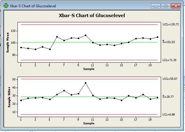
Example of X-bar and S chart
You are conducting a study on the blood glucose levels of 9 patients who are on strict
diets and exercise routines. To monitor the mean and standard deviation of
the blood glucose levels of your patients, create an X-bar and S chart. You take a blood
glucose reading every day for each patient for 20 days.
How to make to X-bar and S chart
1 Open the worksheet BLOODSUGAR.MTW.
2 Choose Stat > Control Charts > Variables Charts for Subgroups > Xbar-S.
3 Choose All observations for a chart are in one column, then enter Glucoselevel.
4 In Subgroup sizes, enter 9. Click OK.
5.we will get to X-bar and S chart below.
Interpreting the results
The glucose level means and standard deviations over the 10-day period fall
within the control limits. The glucose level and its variability are in control for
the nine patients on the diet and exercise program.
Reference by www.minitab.com
Variables Control Charts for Subgroups Overview data
 |
| X-bar and S chart |
as length or pressure
, for subgroup data. Variables control charts for individuals,
time-weighted charts, and multivariate charts also plot measurement data.
Attributes control charts plot count data, such as the number of defects or defective units.
For more information about control charts, see Control Charts Overview.
Choosing a variables control chart for subgroups
Minitab offers five variables control charts:
• X-bar and R − an X-bar chart and R chart displayed in one window
• X-bar and S − an X-bar chart and S chart displayed in one window
• I-MR-R/S (Between/Within) − a three-way control chart that uses both
between-subgroup and within-subgroup variation. An I-MR-R/S chart consists of
an I chart, a MR chart, and a R or S chart.
• X-bar − a chart of subgroup means
• R − a chart of subgroup ranges
• S − a chart of subgroup standard deviations
• Zone − a chart of the cumulative scores based on each point's distance
from the center line
The I-MR-R/S (Between/Within) chart requires that you have two or more
observations in at least one subgroup. Subgroups do not need to be the same size.
Minitab calculates summary statistics for each subgroup, which are plotted
on the chart and used to estimate process parameters.
Example of X-bar and S chart
You are conducting a study on the blood glucose levels of 9 patients who are on strict
diets and exercise routines. To monitor the mean and standard deviation of
the blood glucose levels of your patients, create an X-bar and S chart. You take a blood
glucose reading every day for each patient for 20 days.
How to make to X-bar and S chart
1 Open the worksheet BLOODSUGAR.MTW.
 |
| X-bar and S chart 2 |
2 Choose Stat > Control Charts > Variables Charts for Subgroups > Xbar-S.
 |
| X-bar and S chart 3 |
3 Choose All observations for a chart are in one column, then enter Glucoselevel.
 |
| X-bar and S chart 4 |
 |
| X-bar and S chart 5 |
4 In Subgroup sizes, enter 9. Click OK.
 |
| X-bar and S chart 6 |
5.we will get to X-bar and S chart below.
|
| X-bar and S chart 7 |
Interpreting the results
The glucose level means and standard deviations over the 10-day period fall
within the control limits. The glucose level and its variability are in control for
the nine patients on the diet and exercise program.
Reference by www.minitab.com
X-bar and R chart
Displays a control chart for subgroup means (an X-bar chart) and a control chart for subgroup
ranges (an R chart) in the same graph window. The X-bar chart is drawn in the upper half
of the screen; the R chart in the lower half. Seeing both charts together allows you to track
both the process level and process variation at the same time, as well as detect the
presence of special causes.
X-bar and R charts are typically used to track the process level and process variation
for samples of size 8 or less, while
X-bar and S charts are used for larger samples.
By default, Minitab's X-bar and R chart bases the estimate of the process variation, σ,
on the average of the subgroup ranges. You can also use a pooled standard deviation,
or enter a historical value for σ.
To display an X-bar and R chart
1 Choose Stat > Control Charts > Variables Charts for Subgroups > Xbar-R.
2 Do one of the following:
• If subgroups are in one or more columns, choose All observations for a chart are in
one column, then enter one or more columns. In Subgroup sizes, enter a number or
a column of subscripts.
• If subgroups are in rows, choose Observations for a subgroup are in one row of
columns, then enter a series of columns.
3 If you like, use any dialog box options, then click OK.
Example of X-bar and R chart
You work at an automobile engine assembly plant. One of the parts, a camshaft,
must be 600 mm +2 mm long to meet engineering specifications.
There has been a chronic problem with camshaft length being out of specification, which
causes poor-fitting assemblies, resulting in high scrap and rework rates.
Your supervisor wants to run X-bar and R charts to monitor this characteristic,
so for a month, you collect a total of 100 observations (20 samples of 5 camshafts each)
from all the camshafts used at the plant, and 100 observations from each of your suppliers.
First you will look at camshafts produced by Supplier 2.
How to make x-bar and R chart
1 Open the worksheet CAMSHAFT.MTW.
2 Choose Stat > Control Charts > Variables Charts for Subgroups > Xbar-R.
3 Choose All observations for a chart are in one column, then enter Supp2.
4 In Subgroup sizes, enter 5. Click OK.
5.we will get to X-bar and R chart below.
Interpreting the results
The center line on the X-bar chart is at 600.23, implying that your process is falling
within the specification limits, but two of the points fall outside the control limits,
implying an unstable process. The center line on the R chart, 3.890, is also
quite large considering the maximum allowable variation is +2 mm.
There may be excess variability in your process.
Note: Test Results for Xbar Chart of Supp2
TEST 1. One point more than 3.00 standard deviations from center line.
Test Failed at points: 2, 14
* WARNING
* If graph is updated with new data, the results above may no
* longer be correct.
References by www.minitab.com
Displays a control chart for subgroup means (an X-bar chart) and a control chart for subgroup
ranges (an R chart) in the same graph window. The X-bar chart is drawn in the upper half
of the screen; the R chart in the lower half. Seeing both charts together allows you to track
both the process level and process variation at the same time, as well as detect the
presence of special causes.
 |
| X-bar and R chart |
X-bar and R charts are typically used to track the process level and process variation
for samples of size 8 or less, while
X-bar and S charts are used for larger samples.
By default, Minitab's X-bar and R chart bases the estimate of the process variation, σ,
on the average of the subgroup ranges. You can also use a pooled standard deviation,
or enter a historical value for σ.
To display an X-bar and R chart
1 Choose Stat > Control Charts > Variables Charts for Subgroups > Xbar-R.
2 Do one of the following:
• If subgroups are in one or more columns, choose All observations for a chart are in
one column, then enter one or more columns. In Subgroup sizes, enter a number or
a column of subscripts.
• If subgroups are in rows, choose Observations for a subgroup are in one row of
columns, then enter a series of columns.
3 If you like, use any dialog box options, then click OK.
Example of X-bar and R chart
You work at an automobile engine assembly plant. One of the parts, a camshaft,
must be 600 mm +2 mm long to meet engineering specifications.
There has been a chronic problem with camshaft length being out of specification, which
causes poor-fitting assemblies, resulting in high scrap and rework rates.
Your supervisor wants to run X-bar and R charts to monitor this characteristic,
so for a month, you collect a total of 100 observations (20 samples of 5 camshafts each)
from all the camshafts used at the plant, and 100 observations from each of your suppliers.
First you will look at camshafts produced by Supplier 2.
How to make x-bar and R chart
1 Open the worksheet CAMSHAFT.MTW.
 |
| X-bar and R chart -1 |
2 Choose Stat > Control Charts > Variables Charts for Subgroups > Xbar-R.
 |
| X-bar and R chart -2 |
3 Choose All observations for a chart are in one column, then enter Supp2.
 |
| X-bar and R chart -3 |
4 In Subgroup sizes, enter 5. Click OK.
 |
| X-bar and R chart -4 |
5.we will get to X-bar and R chart below.
 |
| X-bar and R chart -5 |
The center line on the X-bar chart is at 600.23, implying that your process is falling
within the specification limits, but two of the points fall outside the control limits,
implying an unstable process. The center line on the R chart, 3.890, is also
quite large considering the maximum allowable variation is +2 mm.
There may be excess variability in your process.
Note: Test Results for Xbar Chart of Supp2
TEST 1. One point more than 3.00 standard deviations from center line.
Test Failed at points: 2, 14
* WARNING
* If graph is updated with new data, the results above may no
* longer be correct.
References by www.minitab.com
Box-Cox Transformation
Performs a Box-Cox procedure for process data used in control charts. To use Box-Cox, the data must be positive.
When you ask Minitab to estimate lambda, you get graphical output. See Box-Cox Transformation − Graphical Output for an explanation of the output.
The Box-Cox transformation can be useful for correcting both nonnormality in process data and subgroup process variation that is related to the subgroup mean. Under most conditions, it is not necessary to correct for nonnormality unless the data are highly skewed. Wheeler [31] and Wheeler and Chambers [30] suggest that it is not necessary to
transform data that are used in control charts, because control charts work well in situations where data are not normally distributed.
They give an excellent demonstration of the performance of control charts when data are collected from a variety of nonsymmetric distributions.
Minitab provides two Box-Cox transformations: a standalone command, described in this section, and a transformation option provided with all control charts, except the Attributes charts. You can use these procedures in tandem. First, use the standalone command as an exploratory tool to help you determine the best lambda value for the transformation. Then,
when you enter the control chart command, use the transformation option to transform the data at the same time you draw the chart.
Dialog box items
All observations for a chart are in one column: Choose if data are in one or more columns, then enter the columns.
Subgroup sizes: Enter a number or a column of subscripts.
Observations for a subgroup are in one row of columns: Choose if subgroups are arranged in rows across several columns, then enter the columns. <Options>
Data − Box-Cox Transformation
Use this command with subgroup data or individual observations. Structure individual observations down a single column. Structure subgroup data in a single column or in rows across several columns − see Data for examples. When you include or exclude rows using control chart options > Estimate, Minitab only uses the non-omitted data to find lambda.
To do a Box-Cox transformation
Example of Box-Cox transformation
The data used in the example are highly right skewed, and consist of 50 subgroups each of size 5. If you like, you can look at the spread of the data both before and after the transformation using Graph > Histogram.
1 Open the worksheet BOXCOX.MTW.
2 Choose Stat > Control Charts > Box-Cox Transformation.
3 Choose All observations for a chart are in one column, then enter Skewed.
4 In Subgroup sizes, enter 5.
5 Click Options. Under Store transformed data in, enterC2. Click OK in each dialog box.
Interpreting the results
The Lambda table contains an estimate of lambda (0.039501) and the best value
(0.000000), which is the value used in the transformation. The Lambda table also includes the upper CI (0.292850) and lower CI (−0.207308), which are marked on the graph by vertical lines.
Although the best estimate of lambda is a very small negative number, in any practical situation you want a lambda value that corresponds to an understandable transformation, such as the square root (a lambda of 0.5) or the natural log (a lambda of 0). In this example, 0 is a reasonable choice because it falls within the 95% confidence interval. Therefore, the natural log transformation may be preferred to the transformation defined by the best estimate of lambda.
The 95% confidence interval includes all lambda values which have a standard deviation less than or equal to the horizontal line. Therefore, any lambda value which has a standard deviation close to the dashed line is also a reasonable value to use for the transformation. In this example, this corresponds to an interval of − 0.207308 to 0.292850.
Thank you for referance by www.minitab.com
Performs a Box-Cox procedure for process data used in control charts. To use Box-Cox, the data must be positive.
 |
| Box-Cox Transformation |
The Box-Cox transformation can be useful for correcting both nonnormality in process data and subgroup process variation that is related to the subgroup mean. Under most conditions, it is not necessary to correct for nonnormality unless the data are highly skewed. Wheeler [31] and Wheeler and Chambers [30] suggest that it is not necessary to
transform data that are used in control charts, because control charts work well in situations where data are not normally distributed.
They give an excellent demonstration of the performance of control charts when data are collected from a variety of nonsymmetric distributions.
Minitab provides two Box-Cox transformations: a standalone command, described in this section, and a transformation option provided with all control charts, except the Attributes charts. You can use these procedures in tandem. First, use the standalone command as an exploratory tool to help you determine the best lambda value for the transformation. Then,
when you enter the control chart command, use the transformation option to transform the data at the same time you draw the chart.
Dialog box items
All observations for a chart are in one column: Choose if data are in one or more columns, then enter the columns.
Subgroup sizes: Enter a number or a column of subscripts.
Observations for a subgroup are in one row of columns: Choose if subgroups are arranged in rows across several columns, then enter the columns. <Options>
Data − Box-Cox Transformation
Use this command with subgroup data or individual observations. Structure individual observations down a single column. Structure subgroup data in a single column or in rows across several columns − see Data for examples. When you include or exclude rows using control chart options > Estimate, Minitab only uses the non-omitted data to find lambda.
To do a Box-Cox transformation
Example of Box-Cox transformation
The data used in the example are highly right skewed, and consist of 50 subgroups each of size 5. If you like, you can look at the spread of the data both before and after the transformation using Graph > Histogram.
1 Open the worksheet BOXCOX.MTW.
 |
| Box-Cox transformation-1 |
 |
| Box-Cox transformation |
 |
| Box-Cox transformation-3 |
 |
| Box-Cox transformation-4 |
 |
| Box-Cox transformation chart |
The Lambda table contains an estimate of lambda (0.039501) and the best value
(0.000000), which is the value used in the transformation. The Lambda table also includes the upper CI (0.292850) and lower CI (−0.207308), which are marked on the graph by vertical lines.
Although the best estimate of lambda is a very small negative number, in any practical situation you want a lambda value that corresponds to an understandable transformation, such as the square root (a lambda of 0.5) or the natural log (a lambda of 0). In this example, 0 is a reasonable choice because it falls within the 95% confidence interval. Therefore, the natural log transformation may be preferred to the transformation defined by the best estimate of lambda.
The 95% confidence interval includes all lambda values which have a standard deviation less than or equal to the horizontal line. Therefore, any lambda value which has a standard deviation close to the dashed line is also a reasonable value to use for the transformation. In this example, this corresponds to an interval of − 0.207308 to 0.292850.
Thank you for referance by www.minitab.com


