
I-MR-R/S Chart
Variables control charts for individuals plot statistics from measurement data, such as length or pressure, for individuals data. Variables control charts for subgroups, time-weighted charts, and multivariate charts also plot measurement data.
Attributes control charts plot count data, such as the number of defects or defective units.
For more information about control charts, see Control Charts Overview.
Choosing a variables control chart for individuals
Minitab offers five variables control charts:
• I-MR − an Individuals chart and Moving Range chart displayed in one window
• Z-MR − a chart of standardized individual observations and moving ranges from short run processes
• Individuals − a chart of individual observations
• Moving Range − a chart of moving ranges
Individuals−Moving Range Chart
An I-MR chart is an Individuals chart and Moving Range chart in the same graph window. The Individuals chart is drawn in the upper half of the screen; the Moving Range chart in the lower half. Seeing both charts together allows you to track both the process level and process variation at the same time, as well as detect the presence of special causes.
See [29] for a discussion of how to interpret joint patterns in the two charts.
By default, I-MR Chart estimates the process variation, σ, with MRbar / d2, the average of the moving range divided by an unbiasing constant. The moving range is of length 2, since consecutive values have the greatest chance of being alike.
You can also estimate σ using the median of the moving range, change the length of the moving range, or enter a
historical value for σ.
Example of I-MR chart
As the distribution manager at a limestone quarry, you want to monitor the weight (in pounds) and variation in the 45 batches of limestone that are shipped weekly to an important client. Each batch should weigh approximately 930 pounds.
You previously created a Moving Average chart. Now you want to examine the same data using an individuals and moving range chart.
How to make the I-MR Chart
1 Open the worksheet EXH_QC.MTW.
2 Choose Stat > Control Charts > Variables Charts for Individuals > I-MR.
3 In Variables, enter Weight.
4 Click I-MR Options, then click the Tests tab.
5 Choose Perform all tests for special causes, then click OK in each dialog box.
6. Click OK and we will see I-MR chart
Interpreting the results
The individuals chart shows 6 points outside the control limits and 22 points inside the control limits exhibiting a nonrandom pattern, suggesting the presence of special causes. The moving range chart shows one point above the control limit. You should closely examine the quarry's processes to improve control over the weight of limestone
shipments.
Reference by www.minitab.com
 |
| I-MR chart |
Attributes control charts plot count data, such as the number of defects or defective units.
For more information about control charts, see Control Charts Overview.
Choosing a variables control chart for individuals
Minitab offers five variables control charts:
• I-MR − an Individuals chart and Moving Range chart displayed in one window
• Z-MR − a chart of standardized individual observations and moving ranges from short run processes
• Individuals − a chart of individual observations
• Moving Range − a chart of moving ranges
Individuals−Moving Range Chart
An I-MR chart is an Individuals chart and Moving Range chart in the same graph window. The Individuals chart is drawn in the upper half of the screen; the Moving Range chart in the lower half. Seeing both charts together allows you to track both the process level and process variation at the same time, as well as detect the presence of special causes.
See [29] for a discussion of how to interpret joint patterns in the two charts.
By default, I-MR Chart estimates the process variation, σ, with MRbar / d2, the average of the moving range divided by an unbiasing constant. The moving range is of length 2, since consecutive values have the greatest chance of being alike.
You can also estimate σ using the median of the moving range, change the length of the moving range, or enter a
historical value for σ.
Example of I-MR chart
As the distribution manager at a limestone quarry, you want to monitor the weight (in pounds) and variation in the 45 batches of limestone that are shipped weekly to an important client. Each batch should weigh approximately 930 pounds.
You previously created a Moving Average chart. Now you want to examine the same data using an individuals and moving range chart.
How to make the I-MR Chart
1 Open the worksheet EXH_QC.MTW.
 |
| I-MR chart-1 |
 |
| I-MR chart-2 |
 |
| I-MR chart-3 |
4 Click I-MR Options, then click the Tests tab.
 |
| I-MR chart-4 |
5 Choose Perform all tests for special causes, then click OK in each dialog box.
 |
| I-MR chart-5 |
|
| I-MR chart-6 |
|
| I-MR chart |
Interpreting the results
The individuals chart shows 6 points outside the control limits and 22 points inside the control limits exhibiting a nonrandom pattern, suggesting the presence of special causes. The moving range chart shows one point above the control limit. You should closely examine the quarry's processes to improve control over the weight of limestone
shipments.
Reference by www.minitab.com
X-bar and S chart
Variables Control Charts for Subgroups Overview data
Variables control charts for subgroups plot statistics from measurement data, such
as length or pressure
, for subgroup data. Variables control charts for individuals,
time-weighted charts, and multivariate charts also plot measurement data.
Attributes control charts plot count data, such as the number of defects or defective units.
For more information about control charts, see Control Charts Overview.
Choosing a variables control chart for subgroups
Minitab offers five variables control charts:
• X-bar and R − an X-bar chart and R chart displayed in one window
• X-bar and S − an X-bar chart and S chart displayed in one window
• I-MR-R/S (Between/Within) − a three-way control chart that uses both
between-subgroup and within-subgroup variation. An I-MR-R/S chart consists of
an I chart, a MR chart, and a R or S chart.
• X-bar − a chart of subgroup means
• R − a chart of subgroup ranges
• S − a chart of subgroup standard deviations
• Zone − a chart of the cumulative scores based on each point's distance
from the center line
The I-MR-R/S (Between/Within) chart requires that you have two or more
observations in at least one subgroup. Subgroups do not need to be the same size.
Minitab calculates summary statistics for each subgroup, which are plotted
on the chart and used to estimate process parameters.
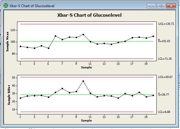
Example of X-bar and S chart
You are conducting a study on the blood glucose levels of 9 patients who are on strict
diets and exercise routines. To monitor the mean and standard deviation of
the blood glucose levels of your patients, create an X-bar and S chart. You take a blood
glucose reading every day for each patient for 20 days.
How to make to X-bar and S chart
1 Open the worksheet BLOODSUGAR.MTW.
2 Choose Stat > Control Charts > Variables Charts for Subgroups > Xbar-S.
3 Choose All observations for a chart are in one column, then enter Glucoselevel.
4 In Subgroup sizes, enter 9. Click OK.
5.we will get to X-bar and S chart below.
Interpreting the results
The glucose level means and standard deviations over the 10-day period fall
within the control limits. The glucose level and its variability are in control for
the nine patients on the diet and exercise program.
Reference by www.minitab.com
Variables Control Charts for Subgroups Overview data
 |
| X-bar and S chart |
as length or pressure
, for subgroup data. Variables control charts for individuals,
time-weighted charts, and multivariate charts also plot measurement data.
Attributes control charts plot count data, such as the number of defects or defective units.
For more information about control charts, see Control Charts Overview.
Choosing a variables control chart for subgroups
Minitab offers five variables control charts:
• X-bar and R − an X-bar chart and R chart displayed in one window
• X-bar and S − an X-bar chart and S chart displayed in one window
• I-MR-R/S (Between/Within) − a three-way control chart that uses both
between-subgroup and within-subgroup variation. An I-MR-R/S chart consists of
an I chart, a MR chart, and a R or S chart.
• X-bar − a chart of subgroup means
• R − a chart of subgroup ranges
• S − a chart of subgroup standard deviations
• Zone − a chart of the cumulative scores based on each point's distance
from the center line
The I-MR-R/S (Between/Within) chart requires that you have two or more
observations in at least one subgroup. Subgroups do not need to be the same size.
Minitab calculates summary statistics for each subgroup, which are plotted
on the chart and used to estimate process parameters.
Example of X-bar and S chart
You are conducting a study on the blood glucose levels of 9 patients who are on strict
diets and exercise routines. To monitor the mean and standard deviation of
the blood glucose levels of your patients, create an X-bar and S chart. You take a blood
glucose reading every day for each patient for 20 days.
How to make to X-bar and S chart
1 Open the worksheet BLOODSUGAR.MTW.
 |
| X-bar and S chart 2 |
2 Choose Stat > Control Charts > Variables Charts for Subgroups > Xbar-S.
 |
| X-bar and S chart 3 |
3 Choose All observations for a chart are in one column, then enter Glucoselevel.
 |
| X-bar and S chart 4 |
 |
| X-bar and S chart 5 |
4 In Subgroup sizes, enter 9. Click OK.
 |
| X-bar and S chart 6 |
5.we will get to X-bar and S chart below.
|
| X-bar and S chart 7 |
Interpreting the results
The glucose level means and standard deviations over the 10-day period fall
within the control limits. The glucose level and its variability are in control for
the nine patients on the diet and exercise program.
Reference by www.minitab.com
X-bar and R chart
Displays a control chart for subgroup means (an X-bar chart) and a control chart for subgroup
ranges (an R chart) in the same graph window. The X-bar chart is drawn in the upper half
of the screen; the R chart in the lower half. Seeing both charts together allows you to track
both the process level and process variation at the same time, as well as detect the
presence of special causes.
X-bar and R charts are typically used to track the process level and process variation
for samples of size 8 or less, while
X-bar and S charts are used for larger samples.
By default, Minitab's X-bar and R chart bases the estimate of the process variation, σ,
on the average of the subgroup ranges. You can also use a pooled standard deviation,
or enter a historical value for σ.
To display an X-bar and R chart
1 Choose Stat > Control Charts > Variables Charts for Subgroups > Xbar-R.
2 Do one of the following:
• If subgroups are in one or more columns, choose All observations for a chart are in
one column, then enter one or more columns. In Subgroup sizes, enter a number or
a column of subscripts.
• If subgroups are in rows, choose Observations for a subgroup are in one row of
columns, then enter a series of columns.
3 If you like, use any dialog box options, then click OK.
Example of X-bar and R chart
You work at an automobile engine assembly plant. One of the parts, a camshaft,
must be 600 mm +2 mm long to meet engineering specifications.
There has been a chronic problem with camshaft length being out of specification, which
causes poor-fitting assemblies, resulting in high scrap and rework rates.
Your supervisor wants to run X-bar and R charts to monitor this characteristic,
so for a month, you collect a total of 100 observations (20 samples of 5 camshafts each)
from all the camshafts used at the plant, and 100 observations from each of your suppliers.
First you will look at camshafts produced by Supplier 2.
How to make x-bar and R chart
1 Open the worksheet CAMSHAFT.MTW.
2 Choose Stat > Control Charts > Variables Charts for Subgroups > Xbar-R.
3 Choose All observations for a chart are in one column, then enter Supp2.
4 In Subgroup sizes, enter 5. Click OK.
5.we will get to X-bar and R chart below.
Interpreting the results
The center line on the X-bar chart is at 600.23, implying that your process is falling
within the specification limits, but two of the points fall outside the control limits,
implying an unstable process. The center line on the R chart, 3.890, is also
quite large considering the maximum allowable variation is +2 mm.
There may be excess variability in your process.
Note: Test Results for Xbar Chart of Supp2
TEST 1. One point more than 3.00 standard deviations from center line.
Test Failed at points: 2, 14
* WARNING
* If graph is updated with new data, the results above may no
* longer be correct.
References by www.minitab.com
Displays a control chart for subgroup means (an X-bar chart) and a control chart for subgroup
ranges (an R chart) in the same graph window. The X-bar chart is drawn in the upper half
of the screen; the R chart in the lower half. Seeing both charts together allows you to track
both the process level and process variation at the same time, as well as detect the
presence of special causes.
 |
| X-bar and R chart |
X-bar and R charts are typically used to track the process level and process variation
for samples of size 8 or less, while
X-bar and S charts are used for larger samples.
By default, Minitab's X-bar and R chart bases the estimate of the process variation, σ,
on the average of the subgroup ranges. You can also use a pooled standard deviation,
or enter a historical value for σ.
To display an X-bar and R chart
1 Choose Stat > Control Charts > Variables Charts for Subgroups > Xbar-R.
2 Do one of the following:
• If subgroups are in one or more columns, choose All observations for a chart are in
one column, then enter one or more columns. In Subgroup sizes, enter a number or
a column of subscripts.
• If subgroups are in rows, choose Observations for a subgroup are in one row of
columns, then enter a series of columns.
3 If you like, use any dialog box options, then click OK.
Example of X-bar and R chart
You work at an automobile engine assembly plant. One of the parts, a camshaft,
must be 600 mm +2 mm long to meet engineering specifications.
There has been a chronic problem with camshaft length being out of specification, which
causes poor-fitting assemblies, resulting in high scrap and rework rates.
Your supervisor wants to run X-bar and R charts to monitor this characteristic,
so for a month, you collect a total of 100 observations (20 samples of 5 camshafts each)
from all the camshafts used at the plant, and 100 observations from each of your suppliers.
First you will look at camshafts produced by Supplier 2.
How to make x-bar and R chart
1 Open the worksheet CAMSHAFT.MTW.
 |
| X-bar and R chart -1 |
2 Choose Stat > Control Charts > Variables Charts for Subgroups > Xbar-R.
 |
| X-bar and R chart -2 |
3 Choose All observations for a chart are in one column, then enter Supp2.
 |
| X-bar and R chart -3 |
4 In Subgroup sizes, enter 5. Click OK.
 |
| X-bar and R chart -4 |
5.we will get to X-bar and R chart below.
 |
| X-bar and R chart -5 |
The center line on the X-bar chart is at 600.23, implying that your process is falling
within the specification limits, but two of the points fall outside the control limits,
implying an unstable process. The center line on the R chart, 3.890, is also
quite large considering the maximum allowable variation is +2 mm.
There may be excess variability in your process.
Note: Test Results for Xbar Chart of Supp2
TEST 1. One point more than 3.00 standard deviations from center line.
Test Failed at points: 2, 14
* WARNING
* If graph is updated with new data, the results above may no
* longer be correct.
References by www.minitab.com
Box-Cox Transformation
Performs a Box-Cox procedure for process data used in control charts. To use Box-Cox, the data must be positive.
When you ask Minitab to estimate lambda, you get graphical output. See Box-Cox Transformation − Graphical Output for an explanation of the output.
The Box-Cox transformation can be useful for correcting both nonnormality in process data and subgroup process variation that is related to the subgroup mean. Under most conditions, it is not necessary to correct for nonnormality unless the data are highly skewed. Wheeler [31] and Wheeler and Chambers [30] suggest that it is not necessary to
transform data that are used in control charts, because control charts work well in situations where data are not normally distributed.
They give an excellent demonstration of the performance of control charts when data are collected from a variety of nonsymmetric distributions.
Minitab provides two Box-Cox transformations: a standalone command, described in this section, and a transformation option provided with all control charts, except the Attributes charts. You can use these procedures in tandem. First, use the standalone command as an exploratory tool to help you determine the best lambda value for the transformation. Then,
when you enter the control chart command, use the transformation option to transform the data at the same time you draw the chart.
Dialog box items
All observations for a chart are in one column: Choose if data are in one or more columns, then enter the columns.
Subgroup sizes: Enter a number or a column of subscripts.
Observations for a subgroup are in one row of columns: Choose if subgroups are arranged in rows across several columns, then enter the columns. <Options>
Data − Box-Cox Transformation
Use this command with subgroup data or individual observations. Structure individual observations down a single column. Structure subgroup data in a single column or in rows across several columns − see Data for examples. When you include or exclude rows using control chart options > Estimate, Minitab only uses the non-omitted data to find lambda.
To do a Box-Cox transformation
Example of Box-Cox transformation
The data used in the example are highly right skewed, and consist of 50 subgroups each of size 5. If you like, you can look at the spread of the data both before and after the transformation using Graph > Histogram.
1 Open the worksheet BOXCOX.MTW.
2 Choose Stat > Control Charts > Box-Cox Transformation.
3 Choose All observations for a chart are in one column, then enter Skewed.
4 In Subgroup sizes, enter 5.
5 Click Options. Under Store transformed data in, enterC2. Click OK in each dialog box.
Interpreting the results
The Lambda table contains an estimate of lambda (0.039501) and the best value
(0.000000), which is the value used in the transformation. The Lambda table also includes the upper CI (0.292850) and lower CI (−0.207308), which are marked on the graph by vertical lines.
Although the best estimate of lambda is a very small negative number, in any practical situation you want a lambda value that corresponds to an understandable transformation, such as the square root (a lambda of 0.5) or the natural log (a lambda of 0). In this example, 0 is a reasonable choice because it falls within the 95% confidence interval. Therefore, the natural log transformation may be preferred to the transformation defined by the best estimate of lambda.
The 95% confidence interval includes all lambda values which have a standard deviation less than or equal to the horizontal line. Therefore, any lambda value which has a standard deviation close to the dashed line is also a reasonable value to use for the transformation. In this example, this corresponds to an interval of − 0.207308 to 0.292850.
Thank you for referance by www.minitab.com
Performs a Box-Cox procedure for process data used in control charts. To use Box-Cox, the data must be positive.
 |
| Box-Cox Transformation |
The Box-Cox transformation can be useful for correcting both nonnormality in process data and subgroup process variation that is related to the subgroup mean. Under most conditions, it is not necessary to correct for nonnormality unless the data are highly skewed. Wheeler [31] and Wheeler and Chambers [30] suggest that it is not necessary to
transform data that are used in control charts, because control charts work well in situations where data are not normally distributed.
They give an excellent demonstration of the performance of control charts when data are collected from a variety of nonsymmetric distributions.
Minitab provides two Box-Cox transformations: a standalone command, described in this section, and a transformation option provided with all control charts, except the Attributes charts. You can use these procedures in tandem. First, use the standalone command as an exploratory tool to help you determine the best lambda value for the transformation. Then,
when you enter the control chart command, use the transformation option to transform the data at the same time you draw the chart.
Dialog box items
All observations for a chart are in one column: Choose if data are in one or more columns, then enter the columns.
Subgroup sizes: Enter a number or a column of subscripts.
Observations for a subgroup are in one row of columns: Choose if subgroups are arranged in rows across several columns, then enter the columns. <Options>
Data − Box-Cox Transformation
Use this command with subgroup data or individual observations. Structure individual observations down a single column. Structure subgroup data in a single column or in rows across several columns − see Data for examples. When you include or exclude rows using control chart options > Estimate, Minitab only uses the non-omitted data to find lambda.
To do a Box-Cox transformation
Example of Box-Cox transformation
The data used in the example are highly right skewed, and consist of 50 subgroups each of size 5. If you like, you can look at the spread of the data both before and after the transformation using Graph > Histogram.
1 Open the worksheet BOXCOX.MTW.
 |
| Box-Cox transformation-1 |
 |
| Box-Cox transformation |
 |
| Box-Cox transformation-3 |
 |
| Box-Cox transformation-4 |
 |
| Box-Cox transformation chart |
The Lambda table contains an estimate of lambda (0.039501) and the best value
(0.000000), which is the value used in the transformation. The Lambda table also includes the upper CI (0.292850) and lower CI (−0.207308), which are marked on the graph by vertical lines.
Although the best estimate of lambda is a very small negative number, in any practical situation you want a lambda value that corresponds to an understandable transformation, such as the square root (a lambda of 0.5) or the natural log (a lambda of 0). In this example, 0 is a reasonable choice because it falls within the 95% confidence interval. Therefore, the natural log transformation may be preferred to the transformation defined by the best estimate of lambda.
The 95% confidence interval includes all lambda values which have a standard deviation less than or equal to the horizontal line. Therefore, any lambda value which has a standard deviation close to the dashed line is also a reasonable value to use for the transformation. In this example, this corresponds to an interval of − 0.207308 to 0.292850.
Thank you for referance by www.minitab.com
Control chart
We will discuss the historys of a control chart using minitab and you can apply to many
aspects of the work
You can use control charts to track process statistics over time and to detect the presence
of special causes.Minitab plots a process statistic, such as a subgroup mean, individual
observation,
weighted statistic, or number of defects, versus sample number or time.
Minitab draws the:
• Center line at the average of the statistic by default
• Upper control limit, 3σ above the center line by default
• Lower control limit, 3σ below the center line by default
Special causes result in variation that can be detected and controlled. Examples include
differences in supplier, shift, or day of the week. Common cause variation, on the other
hand, is inherent in the process. A process is in control when only common causes − not
special causes − affect the process output.
A process is in control when points fall within the bounds of the control limits, and the points
do not display any nonrandom patterns. Use the tests for special causes offered with
Minitab's control charts to detect nonrandom patterns in your data.
You can also perform a Box-Cox transformation on non-normal data.
When a process is in control, you can use control charts to estimate process parameters
needed to determine capability.
Minitab offers a variety of options for customizing your control charts:
• See Control Chart Options for options specific to control charts, such as using stages
and tests for special causes.
• See Control Chart Display Options for options that are available before graph creation, such
as subsetting your data and changing the control chart's title.
• See Graph Editing Overview for options that are available after graph creation, such
as changing font size and figure location.
Exsamples of Control chart
The following examples illustrate how to generate control charts with Minitab.
Choose an example below:
1. Box-Cox transformation
2. X-bar and R chart
3. X-bar and S chart
4. I-MR-R/S Chart
5. X-Bar Chart
6. R Chart
7. S chart
8. zone chart
9. I-MR chart
10. Z-MR chart
11. Individuals chart
12. moving range chart
13. P Chart
14. NP chart
15. C chart
16. U chart
Referances: www.minitab.com
We will discuss the historys of a control chart using minitab and you can apply to many
aspects of the work
You can use control charts to track process statistics over time and to detect the presence
of special causes.Minitab plots a process statistic, such as a subgroup mean, individual
observation,
weighted statistic, or number of defects, versus sample number or time.
Minitab draws the:
• Center line at the average of the statistic by default
• Upper control limit, 3σ above the center line by default
• Lower control limit, 3σ below the center line by default
 |
| Control chart |
Special causes result in variation that can be detected and controlled. Examples include
differences in supplier, shift, or day of the week. Common cause variation, on the other
hand, is inherent in the process. A process is in control when only common causes − not
special causes − affect the process output.
A process is in control when points fall within the bounds of the control limits, and the points
do not display any nonrandom patterns. Use the tests for special causes offered with
Minitab's control charts to detect nonrandom patterns in your data.
You can also perform a Box-Cox transformation on non-normal data.
When a process is in control, you can use control charts to estimate process parameters
needed to determine capability.
Minitab offers a variety of options for customizing your control charts:
• See Control Chart Options for options specific to control charts, such as using stages
and tests for special causes.
• See Control Chart Display Options for options that are available before graph creation, such
as subsetting your data and changing the control chart's title.
• See Graph Editing Overview for options that are available after graph creation, such
as changing font size and figure location.
Exsamples of Control chart
The following examples illustrate how to generate control charts with Minitab.
Choose an example below:
1. Box-Cox transformation
2. X-bar and R chart
3. X-bar and S chart
4. I-MR-R/S Chart
5. X-Bar Chart
6. R Chart
7. S chart
8. zone chart
9. I-MR chart
10. Z-MR chart
11. Individuals chart
12. moving range chart
13. P Chart
14. NP chart
15. C chart
16. U chart
Referances: www.minitab.com
Symmetry Plot
Symmetry plots can be used to assess whether sample data come from a symmetric distribution. Many statistical procedures assume that data come from a normal distribution. However, many procedures are robust to violations of normality, so having data from a symmetric distribution is often sufficient. Other procedures, such as nonparametric methods, assume symmetric distributions rather than normal distributions.
Therefore, a symmetry plot is a useful tool in many circumstances.
When use to Symmetry Plot
When the sample data follow a symmetric distribution, the X and Y coordinates will be approximately equal for all points and the data will fall in a straight line. Minitab draws a line on the plot to represent exact X-Y equality (a perfectly symmetric sample).
By comparing the data points to the line, you can assess the degree of symmetry present in the data. The more symmetric the data, the closer the points will be to the line. Even with normally distributed data, you can expect to see runs of points above or below the line. The important thing to look for is whether the points remain close to or parallel to the line, versus the points diverging from the line. You can detect the following asymmetric conditions.
Mark to Symmetry Plot
we will carify by sample of Minitab sample. Before doing further analyses, you would like to determine whether or not the sample data come from a symmetric
distribution.
1.Open the worksheet EXH_QC.MTW.

3.Choose Stat > Quality Tools > Symmetry Plot.

4. In Variables, enter Faults. Click OK.

5. After that click OK that show Graph window output below.
Interpreting the results
Notice the few points above the line in the upper right corner. These points indicate skewness in the left tail of the
distribution. You can also see this skewness in the histogram.
Refer by www.minitab.com
 |
| Symmetry Plot |
Symmetry plots can be used to assess whether sample data come from a symmetric distribution. Many statistical procedures assume that data come from a normal distribution. However, many procedures are robust to violations of normality, so having data from a symmetric distribution is often sufficient. Other procedures, such as nonparametric methods, assume symmetric distributions rather than normal distributions.
Therefore, a symmetry plot is a useful tool in many circumstances.
When use to Symmetry Plot
When the sample data follow a symmetric distribution, the X and Y coordinates will be approximately equal for all points and the data will fall in a straight line. Minitab draws a line on the plot to represent exact X-Y equality (a perfectly symmetric sample).
By comparing the data points to the line, you can assess the degree of symmetry present in the data. The more symmetric the data, the closer the points will be to the line. Even with normally distributed data, you can expect to see runs of points above or below the line. The important thing to look for is whether the points remain close to or parallel to the line, versus the points diverging from the line. You can detect the following asymmetric conditions.
Mark to Symmetry Plot
we will carify by sample of Minitab sample. Before doing further analyses, you would like to determine whether or not the sample data come from a symmetric
distribution.
1.Open the worksheet EXH_QC.MTW.

3.Choose Stat > Quality Tools > Symmetry Plot.

4. In Variables, enter Faults. Click OK.

5. After that click OK that show Graph window output below.
 |
| Symmetry Plot |
Interpreting the results
Notice the few points above the line in the upper right corner. These points indicate skewness in the left tail of the
distribution. You can also see this skewness in the histogram.
Refer by www.minitab.com
Multi-Vari Chart
Minitab 16 can draws multi-vari charts for up to four factors. Multi-vari charts are a way of presenting analysis of variance data in a graphical form providing a "visual" alternative to analysis of variance. These charts may also be used in the preliminary
stages of data analysis to get a look at the data. The chart displays the means at each factor level for every factor.
When do you use Multi Vari Chart
You need one numeric column for the response variable and up to four numeric, text, or date/time factor columns. Each row contains the data for a single observation.
Text categories (factor levels) are processed in alphabetical order by default. If you wish, you can define your own order −see Ordering Text Categories.Minitab automatically omits missing data from the calculations.
Example of a Multi-Vari Chart
You are responsible for evaluating the effects of sintering time on the compressive strength of three different metals. Compressive strength was measured for five specimens for each metal type at each of the sintering times: 100 minutes,150 minutes, and 200 minutes. Before you engage in a full data analysis, you want to view the data to see if there are any visible trends or interactions by creating a multi-vari chart.
1 Open the worksheet SINTER.MTW.

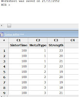
you will see to data ==>
2 Choose Stat > Quality Tools > Multi-Vari Chart.
 Response: Enter the column containing the response (measurement) data.
Factor 1: Enter the factor level column.
Factor 2: Enter an additional factor level column.
Factor 3: Enter an additional factor level column.
Factor 4: Enter an additional factor level column.
3. In Response, enter Strength.
 In Response, enter the column containing the response (measurement) data.
4 In Factor 1, enter SinterTime. In Factor 2, enter MetalType. Click OK.
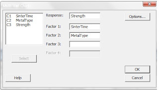 In Factor 1, enter a factor level column.
Interpreting the results
The multi-vari chart indicates that an interaction exists between the type of metal and the length of time it is sintered. The greatest compressive strength for Metal Type 1 is obtained by sintering for 100 minutes, for Metal Type 2 sintering for 150 minutes, and for Metal Type 3 sintering for 200 minutes.To quantify this interaction, you could further analyze this data using techniques such as analysis of variance or general linear model.
Learn more... Run chart
 |
| Multi-Vari Chart |
stages of data analysis to get a look at the data. The chart displays the means at each factor level for every factor.
When do you use Multi Vari Chart
You need one numeric column for the response variable and up to four numeric, text, or date/time factor columns. Each row contains the data for a single observation.
Text categories (factor levels) are processed in alphabetical order by default. If you wish, you can define your own order −see Ordering Text Categories.Minitab automatically omits missing data from the calculations.
Example of a Multi-Vari Chart
You are responsible for evaluating the effects of sintering time on the compressive strength of three different metals. Compressive strength was measured for five specimens for each metal type at each of the sintering times: 100 minutes,150 minutes, and 200 minutes. Before you engage in a full data analysis, you want to view the data to see if there are any visible trends or interactions by creating a multi-vari chart.
1 Open the worksheet SINTER.MTW.


you will see to data ==>
2 Choose Stat > Quality Tools > Multi-Vari Chart.

Factor 1: Enter the factor level column.
Factor 2: Enter an additional factor level column.
Factor 3: Enter an additional factor level column.
Factor 4: Enter an additional factor level column.
3. In Response, enter Strength.

4 In Factor 1, enter SinterTime. In Factor 2, enter MetalType. Click OK.
 In Factor 1, enter a factor level column.
- If you have more than one factor, enter columns in Factor 2, Factor 3, or Factor 4 as needed.
- If you like, use any dialog box items, then click OK.
|
| Multi-Vari Chart |
The multi-vari chart indicates that an interaction exists between the type of metal and the length of time it is sintered. The greatest compressive strength for Metal Type 1 is obtained by sintering for 100 minutes, for Metal Type 2 sintering for 150 minutes, and for Metal Type 3 sintering for 200 minutes.To quantify this interaction, you could further analyze this data using techniques such as analysis of variance or general linear model.
Learn more... Run chart


